The standard UI allows you to specify many aspects of customisation, however when more extensive customisations are required, then using CSS script can provide many more options.
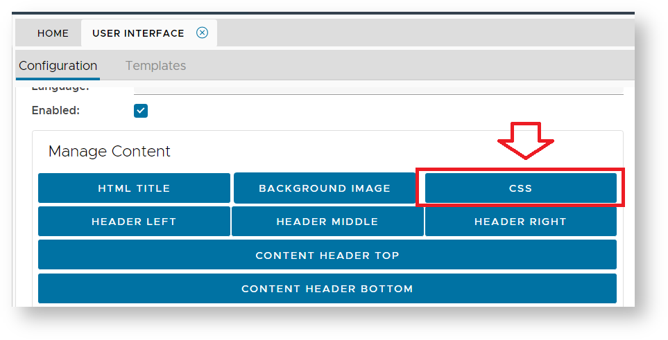
In the "Manage Content" section there is a button for providing CSS customisations;
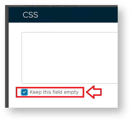
Once the CSS script button has been clicked you will need to ensure that the "Keep this field empty" has been de-selected;
You can now supply script that will allow more extensive customisations of the form designs. These customisations include;
- Changing the background images used in various sections, and behind various images.
- Changing the colours, sizes and styles of the default fonts used.
- Repositioning the contents and separations of the various sections of the page being customised.
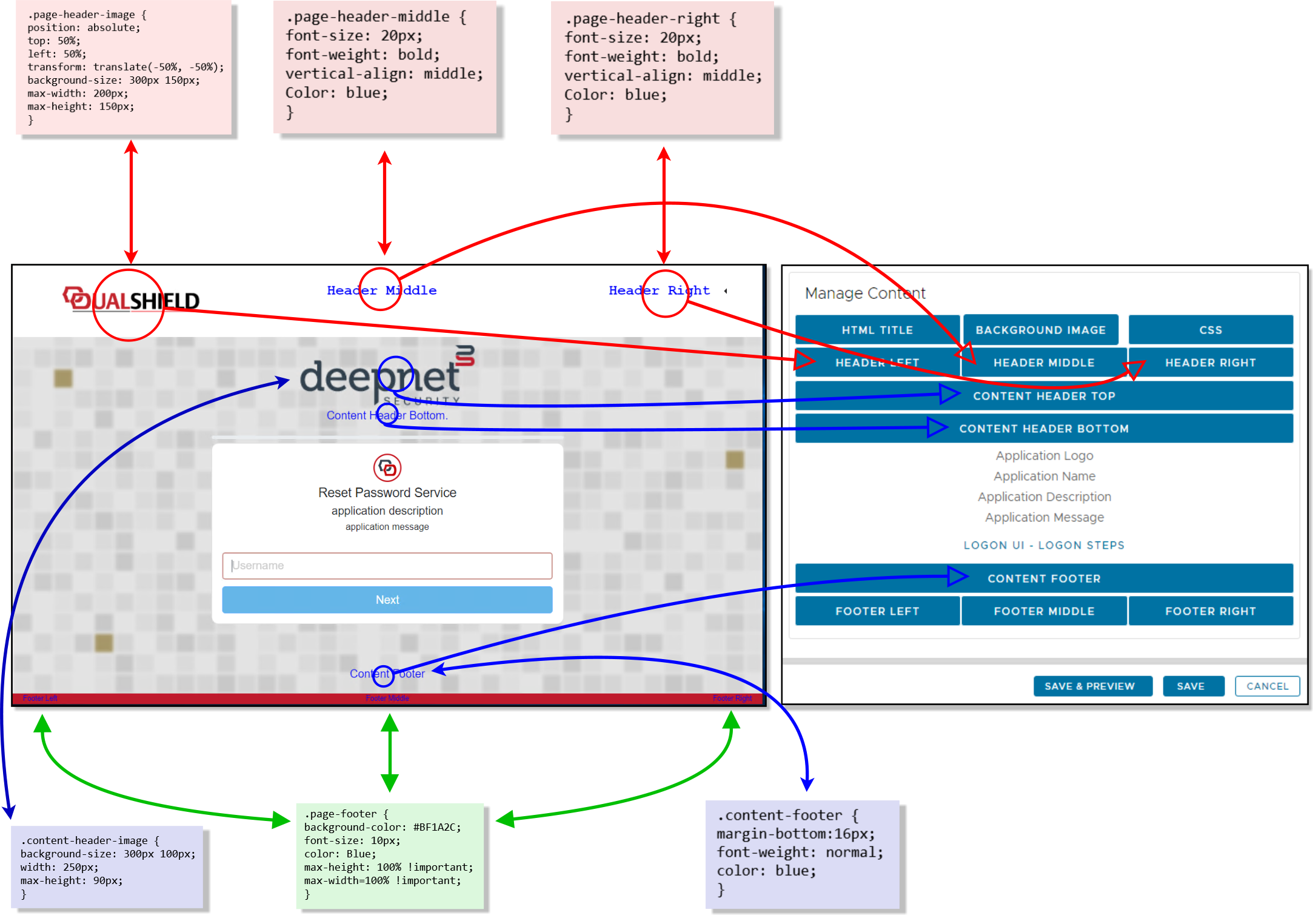
In order to perform these types of CSS customisations you need to be aware of the following main CSS sections;
| Manage Content | Script | Notes |
|---|---|---|
| Page Header | .page-header {} | This section can adjust the height, margins and style of the top section of the page. |
| Page Header Middle | .page-header-middle {} | Centre section of the page header. |
| Page header Right | .page-header-right {} | Right corner of the page header. |
| Header Left | .page-header-image {} | Size, placement and background of the image displayed in the "Header Left" section. |
| Header Middle | .page-header-middle {} | Control the font colour and style of the text in the "Header Middle" section. |
| Header Right | .page-header-right {} | Control the font colour and style of the text in the "Header Right" section. |
| Content Header Top | .content-header-image {} | Size, placement and background of the image displayed in the "Content Header Top" section. |
| Content Header Bottom | .content-header {} | Control the font colour and style of the text in the "Content Header Bottom" section. |
| Content Middle | .content-middle () | Control the section where credentials are entered. |
| Content Footer | .content-footer {} | Control the font colour and style of the text in the "Content Footer" section. |
| Page Footer | .page-footer {} | Control the font colour and style of the text in the "Page Footer" section. |
| Page Footer Left | .page-footer-left {} | Left corner of the page footer. |
| Page Footer Right | .page-footer-right {} | Right corner of the page footer. |
The following diagram illustrates examples of how each of these areas can be customised;
Customising the credential input card
By default, the section of the SSO credential input card (where the user supplies there credentials) will appear as a white box with rounded corners;

Many aspects of this card can be customised using CSS;
The progress bar appears as a thin grey line above the credential input card;

This line can be hidden from the input form after applying the following CSS script;
CSS.progress { visibility: hidden; }After the script is applied the progress bar will be removed;

You might want to add a texture to the credential card.
The following script provides changes the background from the standard white background to a metal effect (using on online texture);
CSS.content-middle { background-image: url("https://www.myfreetextures.com/wp-content/uploads/2011/06/brushedsteel5-500x375.jpg"); }After the script is applied the credentials card background adopts the texture of the linked image;

The default appearance of the card is with a white opaque box with rounded corners;

The first simple change you may want to perform is to change the colour and opacity of the card.
The following script provides how this background may be changed to a light blue background;
CSS.content-middle { background: rgba(138, 200, 234, 0.7); /* light blue background with 70% opacity */ }After the script is applied the credentials card background colour is partially transparent with a pale blue colour;

Whilst this appear to be working, if there are additional credentials we see this unfortunate side-effect;

The additional white lines can be fixed if we update the script as follows;
CSS.content-middle { background: rgba(138, 200, 234, 0.7); /* light blue background with 70% opacity */ } .logon-step-card { background-color: transparent; !important; }This now resolves the issue of white backgrounds between the logon steps;

To complete the glass effect we can add a blur to the image.
This effect shows best when a high res image is used as an alternative to the default background method.

In the example above we load the image as a replacement for the default icon (top left), then apply the following CSS script
CSS.progress { visibility: hidden; } .content-middle { background: rgba(138, 200, 234, .2); /* light blue background with 20% opacity */ -webkit-backdrop-filter: blur(10px); /* For compatibility with older Webkit browsers */ padding: 20px; backdrop-filter: blur(10px); /* The key property for the blur effect */ } .logon-step-card { background-color: transparent; !important; } .page-header-image { position: absolute; top: 0px; left: 0px; background-size: 300px 150px; width: 100vw; height: 100vw; max-height: 50vw; Color: black; } .content-middle { background: rgba(138, 200, 234, .2); /* light blue background with 20% opacity */ -webkit-backdrop-filter: blur(10px); /* For compatibility with older Webkit browsers */ padding: 20px; backdrop-filter: blur(10px); /* The key property for the blur effect */ } .logon-step-card { background-color: transparent; !important; }The end result is a convincing glass effect;

If you don't want any background at all on the credential card, then this can also be removed;

To remove both the progress bar, and the credential card background (including its border), use the following script;
CSS.progress { visibility: hidden; } .content-middle { background: rgba(128, 128, 128, 0.001); /* transparent background */ } .card.content-middle.login-card { border: 0; }Once applied the card no longer has a background or border;

In addition to changing the background colour/appearance, you might also want to change the colours of the button on the credential card.

The background, border and text colours of this button can be changed using the following script;
CSS.btn-primary { color: white !important; /* this changes the colour of the text on the button button */ border-color: black !important; /* this changes the border colour around the button */ background-color: rgb(50,50,50) !important; /* this changes the background colour of the button to dark grey */ }With these changes applied, the background colour of the button changes to black;

By combining CSS effects (as mentioned above) you can transform the logon screen to something like this;
